Sloped Ceiling Colour Ideas That Make a Loft Conversion Feel Bigger
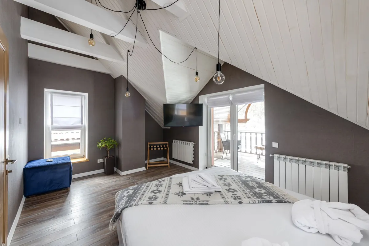
Sloped ceilings are often the best thing about a loft conversion — and the trickiest thing to decorate. Get the colour right and the room feels generous and calm. Get it wrong and the eaves seem to press down on you, especially once the furniture is in. The good news is that paint is the cheapest way to change how a room reads, and a few reliable principles do most of the work.
Why colour behaves differently under a slope
Light rarely reaches a sloped ceiling evenly. It falls in from a dormer or rooflight, skims across the high side and leaves the far end of the slope in a soft shadow. A colour that looks warm and chalky on a flat wall can turn grey and slightly grubby up there, and a brilliant white can look flat rather than bright.
The second issue is lines. Every place two surfaces meet creates an edge, and the eye reads edges as boundaries — which makes a room feel smaller. A typical loft has more of them than any other room: the slope meeting the wall, the knee wall meeting the floor, the ceiling meeting the gable end. Most of the best schemes are simply about reducing those visible breaks and pushing light back into the low corners.
Direction matters too. North-facing lofts receive cool, blue-toned light, so cool greys and blue-whites can look dingy. Warm neutrals with a hint of red or yellow hold their own there. South-facing rooms get stronger, warmer light, which suits cooler colours and soft greens.
The single-colour approach
Painting the slopes, walls and ceiling in one colour — sometimes called colour drenching — is the most effective trick in a loft. When every surface matches, the joins disappear and the room reads as one continuous volume. The low side stops announcing itself as a problem area.
Contrary to the old advice about keeping small rooms pale, mid-depth colours work well here. A muted green, a soft clay pink or a mid-blue carried across every surface feels intentional and cocooning rather than shrinking. What makes rooms feel tight is contrast, not depth.
Getting the details right
- Take the same colour onto skirting boards, door frames, window reveals and radiators. A white skirting line cutting across a dark wall is a hard edge you do not need.
- Use a durable eggshell on the trim rather than the same matt emulsion. The slight sheen difference gives a quiet definition without introducing a contrasting colour.
- Avoid pure brilliant white on slopes. It has nowhere to go in low light and can look shadowy and unfinished.
- Choose a colour with a little pigment in it. Off-whites, stone, greige and muted mid-tones read far better under a slope than the lightest tint on the card.
Where a feature wall works — and where it doesn't
Dark colours do not automatically shrink a room, but placement matters enormously in a loft. Put the drama on the tall gable end wall, ideally behind a bed or a sofa. The eye is drawn upwards to the height, which is exactly what you want it to notice.
Resist painting the slope itself a dark shade. It hangs over the room and makes the ceiling feel closer than it is. If you want something bolder at the low end of the room, apply it to the short vertical knee wall instead. That wall is a small area, so a strong colour has far less surface to dominate — and it makes whatever sits against it, such as built-in storage or a desk, look deliberate.
Two-tone and colour-blocking ideas
A sharp horizontal band across a slope draws attention straight to the angle, so approach stripes and blocks with care. Where two-tone schemes work well is when the change happens at a natural architectural line — the point where the slope begins, or the top of a run of built-in wardrobes.
- Gradient tones. Use three shades of the same colour: the deepest on the knee wall, the mid-tone on the vertical walls, the lightest on the slope and ceiling. It guides the eye upwards.
- Lighter slope, stronger wall. Keep the angle quiet and let the vertical surfaces carry the colour.
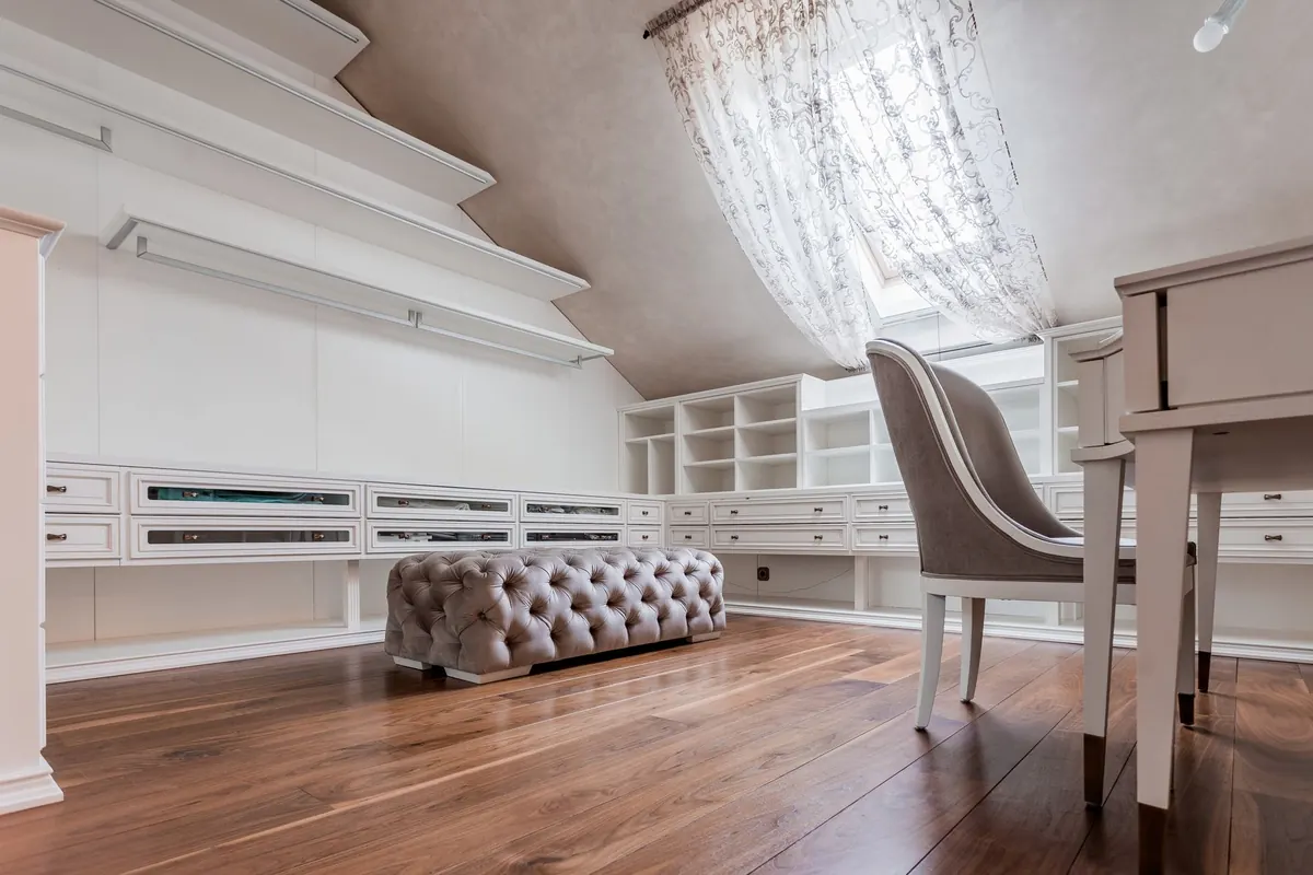
- Match the joinery. Paint fitted wardrobes and shelving in the wall colour so they dissolve into the room rather than adding bulk.
- Vertical stripes on the gable end. Fine stripes on the tallest wall add apparent height. Keep them away from the slope.
Finishes, trims and small details
Matt emulsion is the right choice for slopes and ceilings, because it hides the slight unevenness of plasterboard and the taped joints around rooflights. In a loft bathroom, use a moisture-resistant finish and give the room proper extraction — paint alone will not solve condensation.
Two small details repay the effort. Paint the window reveal in the same colour as the wall so the light does not bounce off a bright white frame, and keep the flooring and curtains within the same tonal family as the walls. A pale oak floor with a soft wool rug in a similar tone to the walls will do more for a sense of space than any single paint decision.
Lighting that lifts a low slope
Colour and light are a single decision, so plan them together. Downlights set into a slope and aimed straight down create pools of light and leave the edges of the room dark — the opposite of what a loft needs.
- Wash the slope with light rather than pointing at the floor. A wall light or an uplighter placed low on the vertical wall bounces light across the angled surface.
- Use a mix of sources: a pendant or ceiling light on the flat section, wall lights on the gable end, and a floor lamp near the low corner.
- Warm bulbs — around 2700K — counteract the cool cast that north-facing lofts can have.
- Dimmers let you drop the light in the evening without losing the sense of height.
Test the colour before you commit
Buy tester pots and paint large samples — at least A3 size, two coats — onto lining paper or board rather than straight onto the wall. Tape one sample to the slope and one to the vertical wall, then live with them for a few days. Look at them in the morning, in the late afternoon and under your artificial lights at night. The difference between the two positions often settles the argument about which shade to use.
If the loft is a habitable room, the structural, insulation and fire-safety work will already have been signed off, so you are free to decorate. For anything involving changes to the fabric of the building, or if the property is listed or in a conservation area, check with your local authority before you start.
Photo: Max Vakhtbovych / Pexels